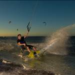
its a pretty slick website - to expand more on the kites and provide more close up photos would have been good though - still good step up from past years - well done!
It is pretty FLASHY but is it just me or is the text blurred! and a headache to read?
This is another site that puts whistles and bells before user experience. A nightmare to navigate and you just get lost in a bunch of poorly rendered animations and badly scaled graphics. The North site has the exact same failings and it is a challenge to get to the content let alone take it in.
I think the current Cabrinha site is leading the fore in terms of a tight site that is easy to use, beautiful and showcases the product well. Companies are unfortunately sucked into such flash ridden and unusable sites with HUGE budgets and are a strain to update.
I have not designed any websites for kite companies yet but it is certainly looking like there is niche to be filled.
I have to say it's definetly one of the fancier looking websites they have put up in the last few years, some wicked pictures, doesn't seem to take too long to load compared to other sites.
I think when you are looking at boards and kites there should be a "back" button in the bottom right hand corner.
its a pretty slick website - to expand more on the kites and provide more close up photos would have been good though - still good step up from past years - well done!