Ted the Kiwi said...
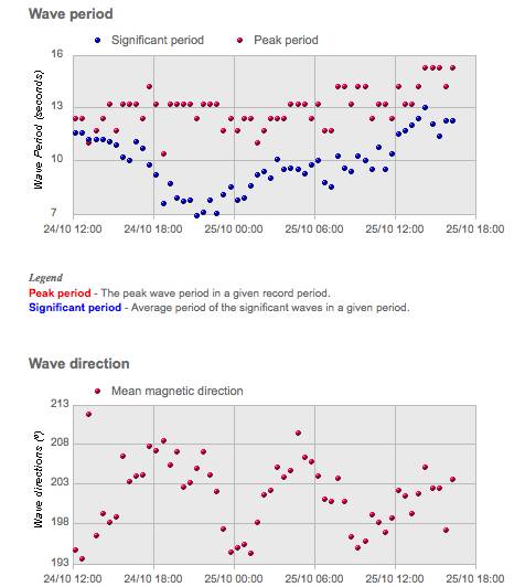
I interpret these charts as telling me we have a 12 second swell on average (with a few longer period ones thrown in) and its mainly coming from the SSW direction. 180 is direct south swell and 270 is west so 203 is pretty much south with a little bit of west in it. The single dots are just points in time that the buoys take readings. Think of them as discrete points - a single point in time. No real need to join them up - just take an overview of them and calculate yourself a rough average. A few degree's is not going to make much difference. Where it gets interesting is when the buoys are picking up to distrinctly different swells at once. Eg: a south swell and a new North East on its way. The good tihng about this chart is that its showing you that the period is increasing as we move forward. A very positive thing to see!!!!
Yep I understand the direction now, the y column is the direction in degrees and 180 degrees is south, 360 or 0 would be north.
Now with the wave period of 12 seconds does that tell us the spacing of the waves or the sets. Would this mean the lower the peak period the more waves?