NSW
6 posts
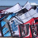
Hi girls and boys, i have uploaded a couple of suggestions for the new SSKC logo if you could vote on which one you like that would be great..
Cheers and see you on the beach Ryno
NSW
4382 posts
Logo 1 for me Ryan
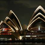
Would prefer a shot of a kiter with only Towra as the backdrop, no refinery or other buildings/man made things.
Cya and
goodwinds
steve

QLD
1245 posts
Non man made things in sydney.... does it still exist?
WA
319 posts
Hey, 2nd one for me but I think removing all the background would be better......keep it plain and more graphic than a photo that looks like it's been through photoshop.
Great work!
NSW
1360 posts
I like logo 1, but I don't like the font and to much solarization
NSW
2528 posts
I hate to point it out but you probly want the logo to be simple and less colors. Take a look at the AKS and the NSW logos (or a shops logo). Granted its generally small no color (or very few) and no frills but its cheep. Big and full color logo's will be expensive to print. Just a though

NSW
9 posts
see comment posted in re-worked logo file....
QLD
18 posts
yeah logo 1 looks good to me

WA
3464 posts
Like that one Cabron, now all we need is to replace the man with the bird and voila!
WA
319 posts
Hey Uber....I think that's great! It would be really easy to make into stickers and use on letterheads etc etc.
This gets my vote as the one SSKC should go for.
Everyone has done a great job with their efforts.
NSW
2528 posts
For the simple stuff I'm siding with Uber. But as far as pretty freak'n sweet goes my hats off to number 5 that rocks.
NSW
180 posts
It would be great to have a simple logo with a chick kiting. Wouldn't mind if we had a few more kiting...
WA
319 posts
There are plenty of female kiters out there, I regularly kite with 4-5, know of around 65 in OZ and NZ with new riders popping up all the time....it's great!
Unfortunately they're not always noticeable because we're usually outnumbered a minimum of 10 to 1 at the beach!
NSW
180 posts
Caelah, when I used to ride in Germany the proportions used to be 3:1 (boys to girls). So I'm sure that a chick on our logo could do us some favours....

NSW
341 posts
Hey there is some great stuff going on here. not sure if anyone has mentioned this already but your logos are going to have to be quite simple, using not many colours, no fancy backdrops of towra etc, stay clear of using white as a fill colour etc.
this logo will be used for t-shirts (printing white on a T is a bitch and you end up with them rubbery ones) stickers, letter heads etc. come up with a complex pic and you'll get a complex bill containing lots of 000's!
if I had the time and wasn't doing all the nswkba stuff I'd have a crack at it.
NSW
55 posts
Right on. Keep it simple. Think screen printing. Not too many colours. Stationary, letterheads, corner of web site, that sort of thing. If we want to do T-shirts later logo + cool photo is OK. Keep up the good work.
el presidente
WA
319 posts
Just added another from Rich.
Like Cabron's contributions. Simple, effective.
I think there are some serious contenders in there.

NSW
226 posts
Nice edit of the photo Caela, thats what i had in mind. The kiter may need a bit more definition but that could probably be reworked a bit. Thanks for the effort, it looks good as does the other black one with the tower in the background though it isn't from a photo like this one.
NSW
55 posts
I love the enthusiasm for the logo competition but remember that the club name is "Southern Sydney Kiteboarding Club" not "South Sydney Kiteboarding Club".

WA
75 posts
No matter what logo, it should be pink...
WA
3464 posts
Nice one Rich...gets my vote.