I disagree Monkey, it's a ****ty ad - the visuals are too small, the copy is too wordy, the copy scrolls in at the end of the sentence, not the start, the visuals are too small.
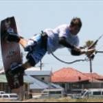
I like the shapes on the kite though, that looks cool.
Skwinty, if you want help with your advertising, PM me, I have a small agency (Darkhorse) in Perth and we do good stuff.
There you go, and ad for an ad.
Ok Monkey, a bad ad for a bad ad.